The importance of Boundary Analysis and how to do it in Micromine

Ron Reid
Group Resource Geologist
Harmony Gold SE Asia Pty Ltd.

This blog post was first published as a series of posts centred around using Leapfrog Software on the orefind.com blog (www.orefind.com/blog) and parts were presented at an AIG talk in Brisbane in 2013. As the last of this series a version of this post titled “Boundary Analysis in Micromine” was published in response to a Micromine Forum question (http://forum.micromine.com/topic/588795-boundary-analysis-plots) asking how to complete a boundary analysis in Micromine.

Most boundary analyses are done using the “down the hole” method where the contact is specified on a drill hole and distances in both directions from the contact counted which can cause errors where the contact is not normal to the drill hole. The better way to do this is using the “Distance from wireframe” method which flags the drill hole or composite file with a distance from a particular wireframe. As the distances from the wireframe are always normal to the surface the actual orientation of the drill hole to the contact doesn’t matter in the analysis. The workflow to do this in Micromine is simple and the whole process can be done entirely within Micromine.

What is Boundary analysis

Boundaries between domains in resource estimation fall into one of four categories (Figure 1);

  1. Hard – where the estimation within the domain does not see grades outside the domain
  2. Soft – where the domain boundary is transparent
  3. Semi-soft – where the boundary is transparent over a short distance (often modelled using an expanded “skin” on the wireframe),
  4. One way Transparent – this is where the estimate for one domain sees a hard boundary but the estimate for the adjacent domain treats the boundary as transparent. These contacts cause problems statistically due to a “double counting” of metal. How you handle this type of domain requires careful consideration.
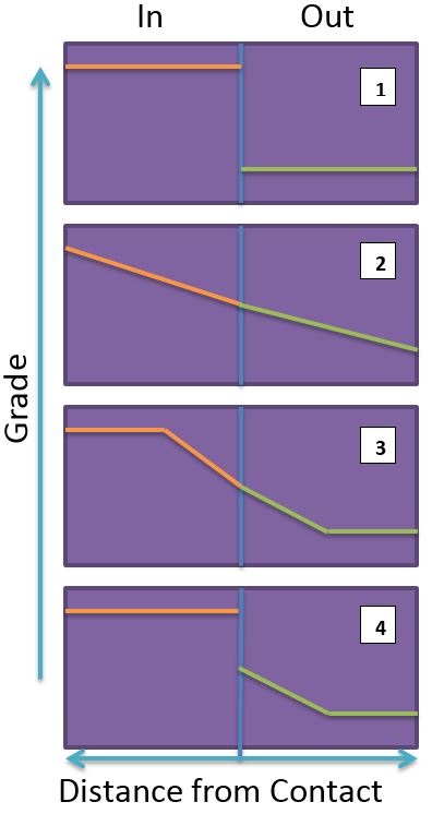
Figure 1. The four types of Boundaries possible within an ore deposit, 1 = Hard, 2 = Soft, 3 = Semi-Soft and 4 = a one way boundary (very common in the real world).

Figure 1. The four types of Boundaries possible within an ore deposit, 1 = Hard, 2 = Soft, 3 = Semi-Soft and 4 = a one way boundary (very common in the real world).

Getting the treatment of the boundary wrong can have drastic consequences for an estimate (Figure 2).

  • Dragging grade from a high grade domain into a low grade domain when the boundary is hard will artificially increase the grade of the low grade domain.
  • Likewise dragging the low grades from the low grade domain into the high grade will drop the grade of the high grade domain.
  • Applying a hard boundary to a domain with a soft contact can artificially increase the grade of the high grade domain.

Mostly these affects are only noticeable locally on the boundary of the domain however the influence can be great on projects with small narrow domains, or where the estimator does not appreciate how anisotropic searches can manipulate space and ends up using very large search ranges in the estimate. In all these situations there is the possibility of a significant and material error being built into the resource.
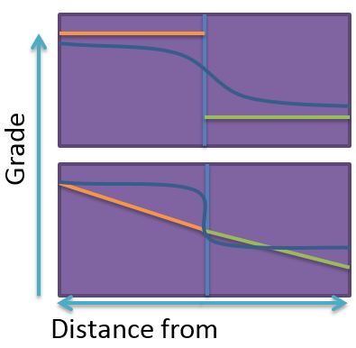
Figure 2. Incorrect handling of the boundary can have drastic consequences for the estimate, Top = using a soft boundary when the boundary should be hard, bottom = using a hard boundary when the boundary should be soft. Dark blue line = estimated grade profile across the boundary (light blue line), green and orange lines represent the actual grade profiles.

Figure 2. Incorrect handling of the boundary can have drastic consequences for the estimate, Top = using a soft boundary when the boundary should be hard, bottom = using a hard boundary when the boundary should be soft. Dark blue line = estimated grade profile across the boundary (light blue line), green and orange lines represent the actual grade profiles.

These errors can;

  • Artificially increase the low grade which may give you enough tonnes to bring a project across the line.
  • Conversely an artificially decrease the high grade which could kill a project that may otherwise be a company maker.

Either way if it is wrong you cop the blame. The lesson is “know your boundaries”!!

Boundary analysis is very deposit and model dependant. Several things must be considered prior to commencing any analysis and a couple of rules of thumb I follow for the boundary analysis are;

  1. Data density – drives your block size and works best if the block is 1/2 to 1/3  your drill hole spacing (arguments over this are in abundance and everyone has their opinion, I’ll take the blue corner…).
  2. Final block size – your distance bins work best if they are set up to around 1/2 your optimal block size.
  3. Composite length – the length of your composite should be optimised to your block size and your mining method, I find this process works well if you composite to 1/4 your block size.

Therefore, if we assume our deposit is drilled to 80x80m spacing, a 40x40m block would not be incorrect and following the rules of thumb above our bin spacing would be 20m and our composite length 10m. Of course this is completely subjective and if your deposit is only 8m wide then a 10m composite and a 40m block is likely to be completely wrong for your deposit.

Some practitioners will want to test the boundary at a very detailed level – say 1m in this example. In my opinion this is far too detailed for the level of information we have. If we are estimating into 40m blocks we are doing so because of the spacing of our informing points and we will want to know what the contact looks like at our block size (or half block size). It may appear to be hard at 1m but at the size of the block it is soft – so that is really how it should be treated. If it is actually hard at 1 or 2 blocks distant then the boundary is hard for our purposes.

While a number of programs will do a boundary analysis they are most commonly done using the “down the hole” method of dividing the distances along a drill hole from a specific contact into bins of a set length and then graphing the result. When your drilling is normal or near normal to the contact this is perfectly reasonable and gives good results (Figure 3 and Figure 4). However, generally in the hard rock mining industry this is not the case as many holes will be at a low angle to the contact (Figure 5). This sort of analysis on drill holes that are at a low angle to the contact will always result in a smoothed un-representative graph that causes the contact to appear soft when this is not the case (Figure 6). There are some programs that you can purchase through various consultancies that attempt to measure the distance from a point to a wireframe but having never used these I cannot comment on their accuracy.  However, if you have a Micromine licence (or Leapfrog or GoCAD) you have access to a robust and accurate method of conducting a boundary analysis using the “distance from wireframe” method, and the beauty of Micromine is it is all internal – no reason to go external to another program just to complete your analysis.
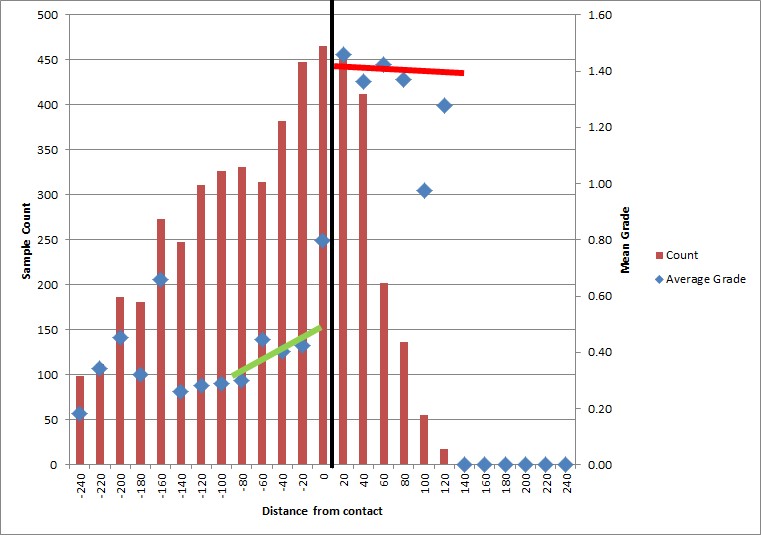
Figure 3

.

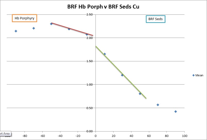
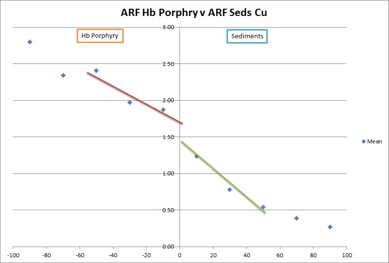
Figure 3. A hard boundary - Top using a standard “down the hole method”, Bottom using the “distance from wireframe” method – the blue diamond at distance 0 is a mixed domain with internal and external data giving you an average of the two (this is not representative), these graphs are from the same contact except the different outputs have resulted in inside and outside being on opposite sides of the graph.
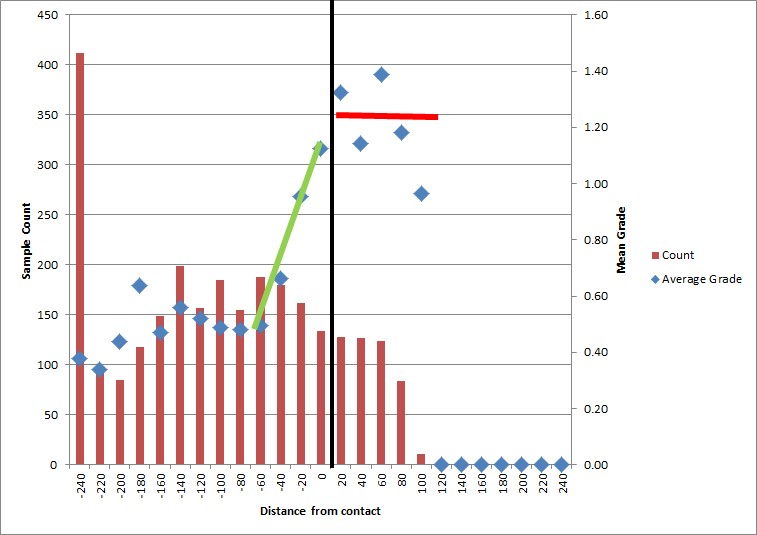
Figure 3. A hard boundary – Top using a standard “down the hole method”, Bottom using the “distance from wireframe” method – the blue diamond at distance 0 is a mixed domain with internal and external data giving you an average of the two (this is not representative), these graphs are from the same contact except the different outputs have resulted in inside and outside being on opposite sides of the graph.

Figure 4

.

Figure 4. A soft boundary using both methods, Top =down the hole method, Bottom using the distance from wireframe method.
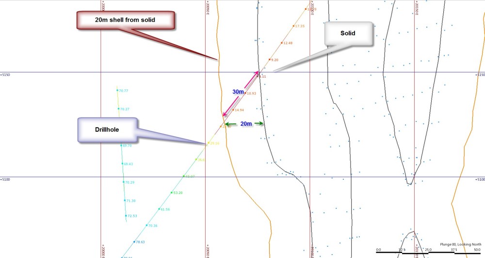
Figure 4. A soft boundary using both methods, Top =down the hole method, Bottom using the distance from wireframe method.

Figure 5. Errors can be built into a “down the hole” analysis through drilling oblique to the contact - distances become "blured" and hide the true nature of the contact.

Figure 5. Errors can be built into a “down the hole” analysis through drilling oblique to the contact – distances become “blured” and hide the true nature of the contact.
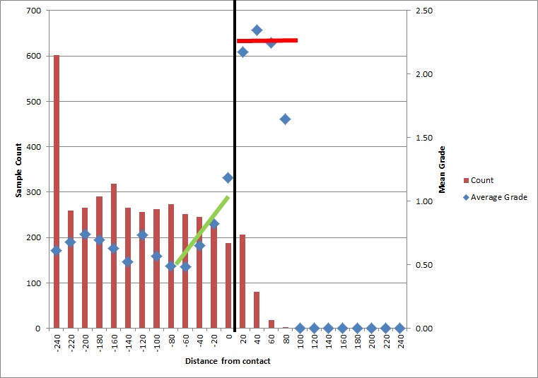
Figure 6

.

Figure 6. A contact where a large percentage of the holes are at a high angle to the contact. Top a= down the hole method counts a lot of mixed bins resulting in a smooth contact, bottom = when the data is measured as distance from wireframe however you get a very different picture - again these are from the exact same contact - notice the domain is only 100m wide, treating this boundary as transparent had drastic consequences on the grade and economics of this domain.

Figure 6. A contact where a large percentage of the holes are at a high angle to the contact. Top a= down the hole method counts a lot of mixed bins resulting in a smooth contact, bottom = when the data is measured as distance from wireframe however you get a very different picture – again these are from the exact same contact – notice the domain is only 100m wide, treating this boundary as transparent had drastic consequences on the grade and economics of this domain.

Mixing of boundaries is another common form of data “pollution” where you may be testing a lithological contact but have neglected to exclude data that may be affecting the result such as an oxide boundary or fault for instance. For any boundary analysis to be accurate it must be done on a like for like basis with as little contamination as possible.

The Micromine Workflow

The first step in Micromine is to have your wireframe you wish to test and a composite file to flag. Remember that boundary analysis can be easily corrupted by improper data selection. For this reason use Micromine’s mesh Boolean options to define a volume with which to flag your data that excludes other contaminating boundaries (Figure 7).
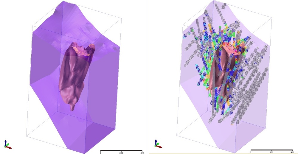
Figure 7. Generate the relevant domain excluding all distracting boundaries - here on the left I have created a volume below the oxide horizon and above a thrust. On the right I have created a subset of the composites that are clipped to the purple domain which I will use to evaluate the distance from the porphyry internal to that domain.

Figure 7. Generate the relevant domain excluding all distracting boundaries – here on the left I have created a volume below the oxide horizon and above a thrust. On the right I have created a subset of the composites that are clipped to the purple domain which I will use to evaluate the distance from the porphyry internal to that domain.

The wireframe I have used here was created using Micromine’s Implicit Modelling process but it could be any implicit or explicitly modelled surface or solid. Note that in Figure 7 there is no data above or below the porphyry that might unduly influence the evaluation. With the data and wireframes in hand the actual workflow is outlined below.

At this point you can flag your composite file with distances from a wireframe using Wireframe ->  Calculations -> Distance from Wireframe  (Figure 8).  There is a lot of information that can be obtained from this form that makes it quite a useful calculation to run. The most important information to record is Distance and Position. The distance is a positive distance between the point and the wireframe surface, it is always positive whether it is from the inside or outside surface. To obtain positive and negative distances you use the position field and code +1 for inside and -1 for outside (or +1 for above and -1 for below when using a surface). For a closed (and valid) solid Outside limits is simply outside the wireframe, for a surface it represents all those samples beyond the extent of the surface – seeing as we have limited our composites to a specific volume if you are using a surface there should be no points beyond the extent of the wireframe and so you need not worry about it. The other options are nice to have and quite useful from a validation point of view – they are the name of the wireframe used (useful when trialling different wireframes – you can easily associate the wireframe to a composite file), the azimuth or direction of the point from the wireframe and the dip of the point from the wireframe surface.

Figure 8. The Distance to wireframes form allows you to flag your composites with distance to wireframe and the position of the point in 3D space with respect to the wireframe volume, use above and below if you are testing a DTM surface.

Figure 8. The Distance to wireframes form allows you to flag your composites with distance to wireframe and the position of the point in 3D space with respect to the wireframe volume, use above and below if you are testing a DTM surface.

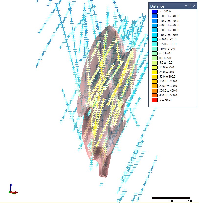
Once you run the form you have a fully flagged table that you can complete the evaluation in Micromine. First you calculate the positive and negative distances by simply running a calculation on the file to calculate them (File -> Fields -> Calculate), it is a simple calculation of WF_Distance = Distance multiplied by position (Figure 9). This gives you a good way of displaying the data and visually validating the calculation, is it doing what you expect it to (Figure 10)?

Figure 9. A simple field calculation gives us the positive and negative distances needed for the calculations.

Figure 9. A simple field calculation gives us the positive and negative distances needed for the calculations.

Figure 10. Composites coloured by calculated distance from wireframe.

Figure 10. Composites coloured by calculated distance from wireframe.

You then need to classify the distances into the relevant bins in order to assess the statistics. Because I am looking to run an estimate into 40m blocks using my rules of thumb discussed earlier I have composited to 10m (which also happens to be a multiple of all my sample lengths – good practice), the best bin size to work with in this case is around 20m (half the block size). For this example I am going to classify my data into bins of 20m which will give me 2 “data points” for each block. I can do this using the File -> Fields -> Generate option (Figure 11).
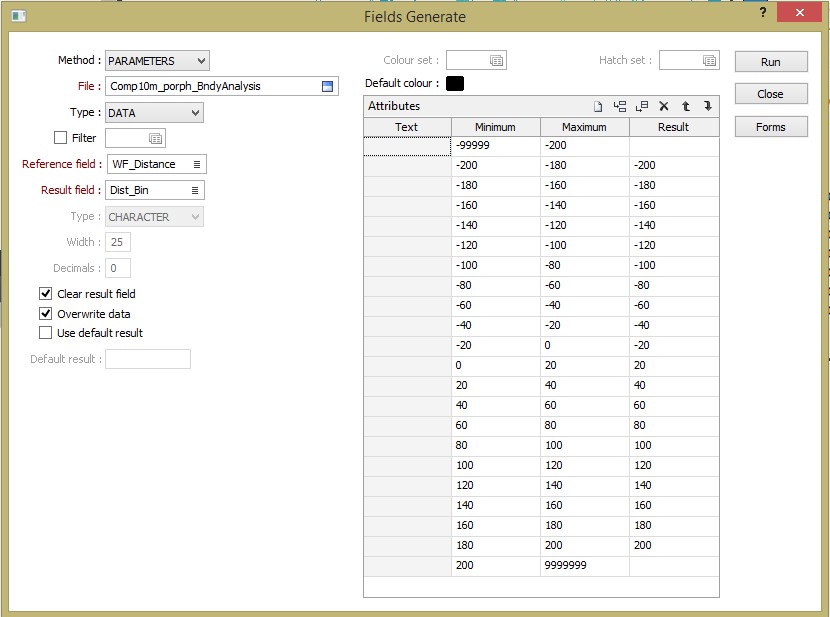
Figure 11. The Fields Generate form - this allows you to classify the distances into Bins for further analysis - here I am using Bins of 20m because my blocks are 40m in size, I leave the bins more than 200m away blank as I am not really interested in this data and at these distances the points start to be influenced by other mineralised bodies and 200m will give me 5 blocks or 10 points of information either side of the contact which should be enough (Yes I know I am clearing then overwriting my results field and I don’t need to do both but “mi nogat wori”…).

Figure 11. The Fields Generate form – this allows you to classify the distances into Bins for further analysis – here I am using Bins of 20m because my blocks are 40m in size, I leave the bins more than 200m away blank as I am not really interested in this data and at these distances the points start to be influenced by other mineralised bodies and 200m will give me 5 blocks or 10 points of information either side of the contact which should be enough (Yes I know I am clearing then overwriting my results field and I don’t need to do both but “mi nogat wori”…).

This process then flags each sample with a Bin ID, to do this the Wireframe distance field must be numeric – if it is character you cannot select minimum and maximum totals so select to modify the file and check. While you are in the file modify section you have to add a field to the table (call it number/sample number/ Number of Bins – whatever you like as long as it is meaningful) and then fill this with 1 (Thanks to Dave Bartlett from Micromine Support for helping me see this simple solution for a sample count and helping me with the final steps of this process).  Then you must sort the file by your new bin field (I sort by the bins first and then WF_Distance second just to be pedantic).

With the composite table flagged by distances, classified into bins and sorted by those bins we can then do a drill hole extract where we extract the data within each bin and average it. If you have a Hole_ID and a depth from and depth to field Micromine will do this extract on a drill hole by drill hole basis when sorted by drill hole and drill hole depth but it still gives us a result we can use, more about this later. If you sort the table by the Bins field first (ascending from negative to positive) the extract will work on the bins only. Go to Drill hole -> Calculations -> Extraction and fill the form as indicated in Figure 12. This will average the assays and sum up the sample count for each bin (and by keeping the file sorted by the HoleID, From and To – each hole if you want that option).
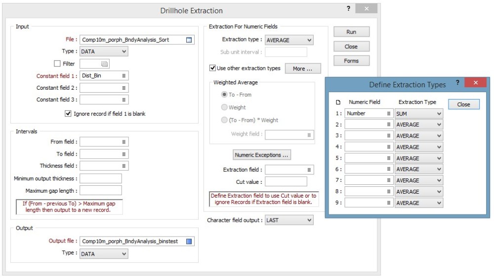
Figure 12. Drillhole Extraction form, my constant field is the distance Bin. I have selected to average the assay fields but I want a count of the number of samples so I need to “use other extraction types” to sum the sample count field I created earlier.

Figure 12. Drillhole Extraction form, my constant field is the distance Bin. I have selected to average the assay fields but I want a count of the number of samples so I need to “use other extraction types” to sum the sample count field I created earlier.

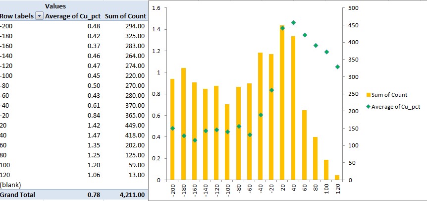
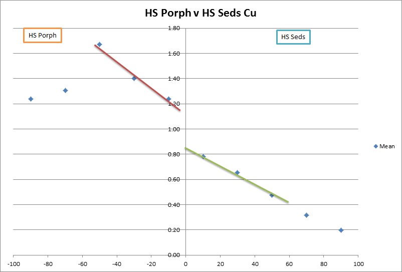
We now have 2 or 3 point files – one complete composite file which is flagged with distance and direction from the wireframe in question which can be graphed, analysed and pulled apart. The information in the main composite file is not only useful for generating the contact analysis but allows you to visually assess what is informing each individual composite and its impact overall. A file that has been composited into distance bins with a sample count for each hole required for the last step in Micromine. And if you have kept the file sorted by HoleID, From and To fields in the composite table prior to running the extract a third file which can also be analysed, pulled apart and assessed, with this table as the bins already done it is an easier process to average the data in each bin using Excel and a pivot table. The pivot table gives you a simple way of grouping the distance data regardless of the Hole ID information, you can then average grades and the sample counts into a format that you can graph (Figure 13), and get a nice tabular representation of the jump in grade if it is there, I prefer to do the lot in Micromine.

Figure 13. Displaying the data as a Pivot Table in Excel.

Figure 13. Displaying the data as a Pivot Table in Excel.

There are a number of ways we can analyse all this data solely in Micromine. First of all you can create a basic scatter plot of grade by distance using either the full composited file or the reduced binned by drill hole file, I generally use the full file as this allows more detailed analysis of the data through synced windows but it does have the affect of masking the boundary a tad as it contains a significant amount of data that can deceive the uninformed eye (Figure 14). These sorts of plots however are very good at keeping us honest. When looking at a plot that contains a single point per bin (Figure 13) it is very easy to believe that there is no scatter behind it – seeing such a significant jump in grade in the plot with all the data helps convince you that the final contact analysis is probably correct.
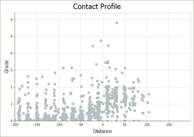
Figure 14. Basic contact profile that plots distance against grade, whilst noisier than a traditional contact profile it does show the sort of scatter you would expect to see in reality and an average line through the data either side of 0m distance indicates that a significant change occurs.

Figure 14. Basic contact profile that plots distance against grade, whilst noisier than a traditional contact profile it does show the sort of scatter you would expect to see in reality and an average line through the data either side of 0m distance indicates that a significant change occurs.

In Figure 15 I have specifically selected one composite, interrogated the dip, azimuth and distance from the wireframe and then created a string file using that information to see what part of the wireframe is informing this point. Very useful when you notice some anomalies in the data and want to find the cause.
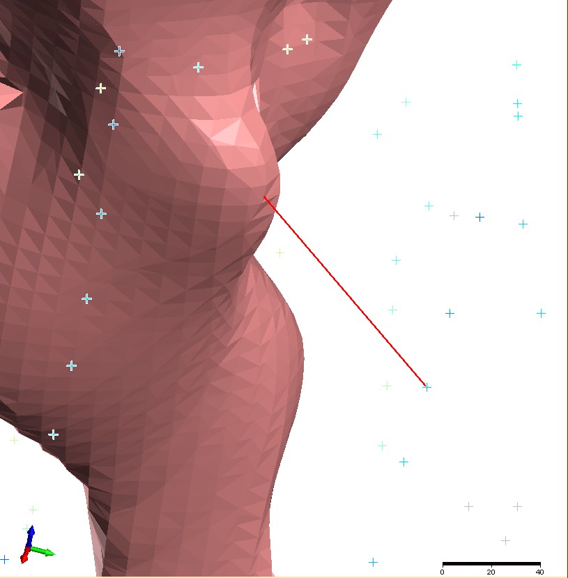
Figure 15. Here I have used the Distance, SurfDip and SurfAzi information in the composite table to identify the exact portion of the wireframe that informs this particular point, remember the information in the comp file is "From" the wireframe so to key in the correct coordinates you must reverse the Azi (+/-180) and Dip angles (90-Dip).

Figure 15. Here I have used the Distance, SurfDip and SurfAzi information in the composite table to identify the exact portion of the wireframe that informs this particular point, remember the information in the comp file is “From” the wireframe so to key in the correct coordinates you must reverse the Azi (+/-180) and Dip angles (90-Dip).

In Figure 16 I have generated some plots from the data and as the various windows have been synced I can click on something in one window and assess the location and impact of this on the analysis. In this case there is an anomalous population of data that sits in the -10 to -30 degree dip window of the histogram, selecting these two bars highlights the data in the stereonet, the main Vizex view and the contact profile plot. I can see that there is a spread of the data both internal to and external to the porphyry wireframe and that while the grades inside the porphyry (Positive distances) are about average for the porphyry the points external to and on the south-eastern side of the porphyry are generally lower in grade than the rest of the dataset which might be important. You could also select all the data above a particular grade and assess the distribution – for instance are all the higher grades in a particular area and do they need to be domained out?
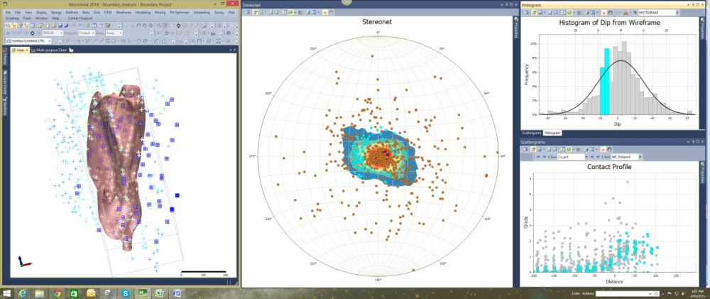
Figure 16. With the various windows linked and the data at hand you can interrogate your data and assess the impact of various populations in the dataset - here for instance there is a prevalence of data in the -10 to -30 degree dip that is biased towards the eastern side. While it does not appear to have an effect on the contact profile analysis internally it does appear to be low on the external dataset.

Figure 16. With the various windows linked and the data at hand you can interrogate your data and assess the impact of various populations in the dataset – here for instance there is a prevalence of data in the -10 to -30 degree dip that is biased towards the eastern side. While it does not appear to have an effect on the contact profile analysis internally it does appear to be low on the external dataset.

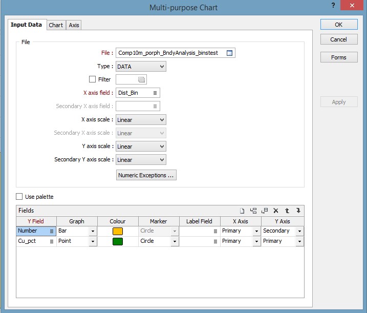
If you have sorted the composite table by bin prior to running the drill hole extraction you will have a new table where all the information is divided into the relevant distance bins only, with a sample count and averaged grades. With this table there is no need to go external to a spreadsheet program as you can use Micromine’s Multi-Purpose Chart option to graph up the results (Figure 17).

Figure 17. Setting up a Contact Profile Chart in Micromine.

Figure 17. Setting up a Contact Profile Chart in Micromine.

The results are then plotted as a chart that shows the sample count and the average grade per bin. Figure 18 shows the copper with a hard boundary, whereas Figure 19 shows the molybdenum chart, clearly this is a soft boundary with the Moly showing no real change across the contact.
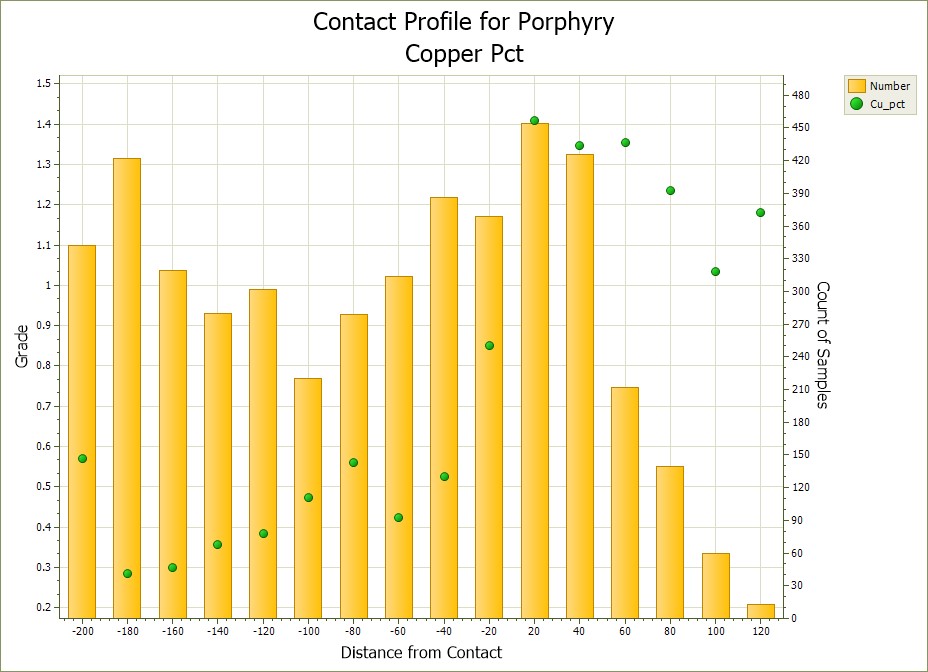
Figure 18. The same contact profile as in Figure 13 but done in Micromine, clearly a hard boundary with over 0.5%  jump in copper across the contact.

Figure 18. The same contact profile as in Figure 13 but done in Micromine, clearly a hard boundary with over 0.5% jump in copper across the contact.
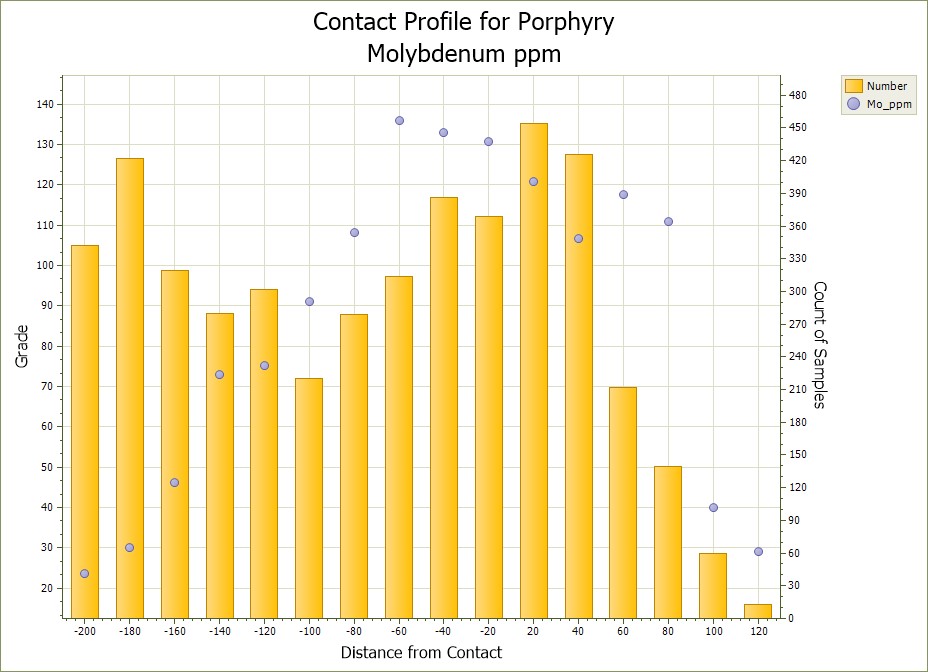
Figure 19. Here we have a Molybdenum chart - clearly here the porphyry contact means next to nothing, just another rock Mo is passing through.

Figure 19. Here we have a Molybdenum chart – clearly here the porphyry contact means next to nothing, just another rock Mo is passing through.

Repeating this analysis over several areas of interest will give a good indication of a realistic search strategy and boundary condition. Large areas can be done rapidly, well within an hour. In this example I have used a thrust and oxidation contact to constrain and assess a lithological contact, the same process can be conducted on any boundary in the dataset, structural boundaries, alteration fronts, oxidation layers etc, very rapidly and with confidence. If your composite file has all your metals of interest to start with then you have everything at hand to rapidly test all your commodities.

Happy Modelling
Scanning and vectorising old mine drawings and maps – Part 4: Finishing

Introduction

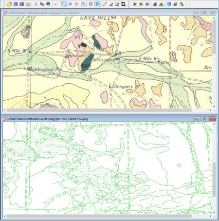
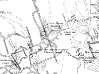
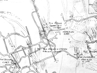
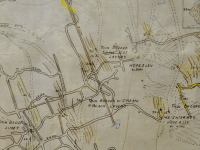
Part 2 of this blog described the preparation and information needed to create a good scan of your original map, and Part 3 outlined some of the ways to prepare and adjust the scanned image and create the best possible digital linework using vectorising software. The result of vectorising the map is a collection of raw linework representing the original map image, as shown on Figure 1 (made using WinTopo).

wintopo-image-and-vector

Figure 1: Original map (top) and resulting vectors displayed in WinTopo Freeware. The windows are aligned so that the map continues from one window to the other

In this part I’ll highlight some techniques for taking the raw linework and turning it into clean, attributed, and optionally 3-D data. Although my focus is on using Micromine as the destination application, this material is equally relevant if you use other software. A GIS-based workflow isn’t all that different from this one.

I often refer to “strings” in the following text. If you’re not a Micromine user simply substitute “polyline” wherever you see the word “string”.

Processing steps

A typical paper-to-digital workflow includes the following steps, and this part discusses steps 7 through 9, shown in bold:

  1. Clean up the paper map
  2. Scan
  3. Crop
  4. Georeference, rectify, and optionally reproject the map as accurately as possible
  5. Enhance and clean up the scanned image
  6. Vectorise (or digitise)
  7. Import into the target application (e.g. Micromine)
  8. Clean up the linework
  9. Join, tag, and attribute the linework, and optionally assign elevations if working in 3-D

 The workflow – raw linework to finished product

Step 7. Import into Micromine (or other software)

Import the vectorised linework into Micromine as a string file, via File | Import | Vector (CAD/GIS/GPS) Data. Unless you used advanced vectorising options there will generally be no attributes or elevations to worry about. If your vectoriser did create attributes, enable Import attributes before importing.

In QGIS, simply load the saved vector data.

Step 8. Clean up the linework in Micromine

Now the hard work begins, although it is possible to automate some parts of this cleaning pass.  Start by displaying the imported data as a Vizex String layer (Vizex is Micromine’s viewing environment) and then getting rid of junk like really short lines (text and misshapen line intersections) and really long lines (borders and gridlines).

Mark for deletion

Although it’s tempting to simply select and delete the offending linework, there’s a very real risk of deleting something important without noticing until it’s too late (ask me how I know). A safer way to clean up the map is to mark the lines for deletion. That way you can unmark them at any time without losing data.

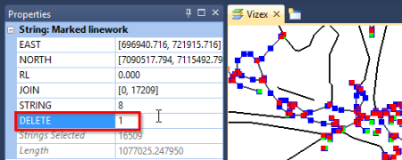
This is easy to do in Micromine: just create a new attribute field called DELETE, select the to-be-deleted line(s), and enter a value like “1” into the DELETE field in the Properties window, as shown on Figure 2. You can instantly see the effect of your action by applying a colour set to the string layer using this field. I use a strong colour for lines I want to keep (DELETE = blank) and a faint or null colour for those marked for deletion (DELETE = 1).

Using the Properties window to mark selected strings for deletion

Figure 2: Using the Properties window to mark selected strings for deletion

To unmark a previously-marked string, simply select it and remove the “1” via the Properties window.

It’s easier to unmark 50 good strings than to manually mark 1000 bad ones.

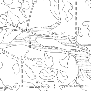
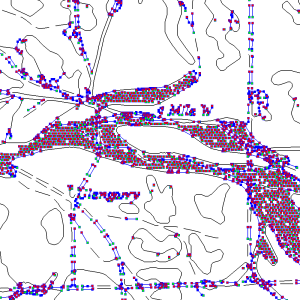
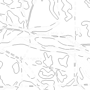
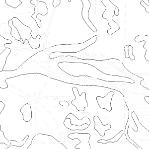
To mark short strings, use Select by Condition to select strings whose Length is less than or equal to some value, which you find experimentally. Be aggressive: your goal is to select and mark all of the small junk knowing that you’ll also catch some valid linework. But, it’s much easier to unmark 50 good strings than to manually mark 1000 bad ones. (The shortest reasonable length to consider is 1.5 times the pixel size, which roughly equals the diagonal dimension of a single pixel.) The sequence shown in Figure 3 illustrates this process.

The original map The original map

Raw vectors
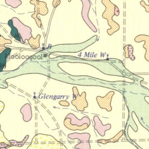
1. The raw vectorised linework, displayed in Micromine. Note how it includes the stipple from the original green polygon along with the rough letterforms of the placenames. The linework also includes unwanted roads, tracks, and drainage patterns. (Some text and dark stipple was edited out of the image before vectorising.)

Selection
2. A length-based selection, where strings whose length is less than or equal to 450 m are selected. (The image pixel size is 25 m.) Note how the selection includes all of the stipple, all of the letterforms, all of the misshapen line intersections, and many of the unwanted long-dash track and drainage lines. Unfortunately it also includes some necessary geological lines.

Marking
3. The result of marking the selected strings for deletion, which are now shown in light grey. Unmarked strings are black. It’s easy to see short geological lines that must be unmarked, along with tracks and drainage lines that still need to be marked.

Final markingFigure 3: Marking strings for deletion
4. A few minutes of manually marking and unmarking strings produces this result. All of the unwanted strings are marked for deletion and all of the geological strings are unmarked, ready for the next step. The small gaps will disappear once the strings are joined.

You can also try a length-based selection with long strings, but because they’re big they’re generally easier to drag a rectangle or click to select.

To select multiple objects in Micromine simply click on the first one and then Ctrl+click the others. Because Ctrl+click toggles the selection you can also use it to deselect something.

For a complex selection – for example to mark lots of small strings in one region – it’s sometimes easier to drag a rectangle to select everything in that region and then Ctrl+click to deselect the ones you want to keep, before marking the rest.

To make a rectangular selection around a slanting line, switch to the Rotate Tool (or use the middle mouse button) and drag while holding down the Z key. This will lock the rotation around the Z-axis, allowing you to swivel the view until the slanting line is aligned with the screen. Then just do a normal rectangular selection.

This cleaning step is usually the most time consuming and it’s important to get it right. Finish marking strings before you do anything else, and don’t worry if you left gaps where you marked short segments – they’ll disappear when you join the strings.

To add the DELETE field in QGIS, open the attribute table and use the New Column button to add an integer field with a width of 1.

You make length-based selections in QGIS with the Select features using an expression button on the Attributes toolbar (or directly within the attribute table), using the inbuilt $length attribute in the Geometry group. You can then update the selected features within the attribute table.

Save unmarked strings

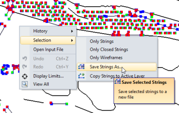
For safety it’s best to keep the marked file as a permanent record of the original vectors, so you shouldn’t physically delete the marked strings. Instead, use Select by Condition to select everything that isn’t marked (e.g. DELETE = blank), then right-click and choose Selection | Save Strings As (or Copy Strings to Active Layer) from the pop-up menu (Figure 4). Micromine will create a new file or layer containing just the unmarked strings.

Save unmarked strings

Figure 4: Saving unmarked strings

To save the unmarked polylines in QGIS, create a selection (e.g. “DELETE” IS NOT 1) and then right-click the layer and choose Save As. Be sure to enable Save only selected features before saving the file.

Step 9. Join, tag and attribute strings

To join individual strings into one long string in Micromine, Ctrl+click the individual strings in the order you want them joined, and then right-click | Join Strings. Joining many strings will be easier in Micromine 2016 because you can just drag a rectangle around them and use the new Coalesce Strings tool to combine them. Micromine 2016 automatically figures out the joining order. We plan to release this version by the middle of next year.

In this step you might have to split strings as well as join them. This typically happens when an attribute value changes partway along a string, for example when a level heading branches off a decline with no break in the sidewall. Simply use the Split String button on the String Editor Tools toolbar to split the string at the transition from decline to level heading. You’re then free to separately tag and attribute each string.

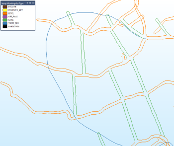
Underground mine workings, coloured by type

Figure 5: Underground mine workings, coloured by type

In Figure 5 horizontal level workings are drawn in brown and inclined workings (raises) are in green. Although there is technically no reason to split the strings at level/raise intersections, it’s necessary so that they can be properly attributed. It would not be possible to colour them differently otherwise.

I find it easiest to attribute the strings right after I join (and optionally split) them. That way I can use the existence of attribute values to keep track of the strings I’ve processed and those I haven’t.

Condition the strings once you finish joining and attributing them so that you avoid problems caused by coincident (or nearly so) points. To do this, select all of the strings and then right-click | Condition String. At the very least you should remove duplicate points and retraced lines, but you could also experiment with setting a smallish minimum separation (equivalent to about one pixel). You may also wish to experiment with simplifying or smoothing the strings.

If you’re carrying out these steps in QGIS you’ll need to convert multi-part features to single parts beforehand, or you’ll have trouble deleting the individual pieces. You do this via Vector | Geometry Tools | Multipart to Singleparts.

In QGIS you join polylines using the Join Multiple Lines plugin, and you split them at any location using the Split Features button on the Advanced Digitising toolbar. Unfortunately I couldn’t find a straightforward way to split polylines at existing vertices. This is one of those jobs that’s much easier to do in a non-topological editor like Micromine than the more restrictive editor of a typical GIS.

Next steps?

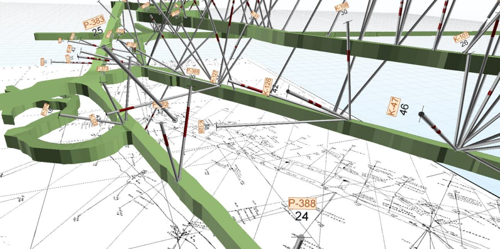
Turning a paper mine plan into digital linework is only one part of this story. The linework needs to be in 3-D and converted to triangulated (wireframe) solids as shown on Figure 6 before it can be used for near-mine exploration or production planning. This process has lots of pitfalls – for example how would you assign elevations to a decline without twisting the floor between the two sidewalls? You can read about this and other topics in Creating-3D-data-from-2D-linework.

Figure 6: Turning paper into 3-D data. Everything in this image, including the drillholes, was acquired from the paper map shown beneath the 3-D solids

Figure 6: Turning paper into 3-D data. Everything in this image, including the drillholes, was acquired from the paper map shown beneath the 3-D solids

Conclusion

Vectorisers don’t always create the cleanest data, even from a clean image, and they generally don’t understand the meaning of each polyline or the transition between one line and the next. These limitations mean that the resulting linework needs some pretty serious attribute and topological editing to put it into a useable form. This last part of the blog provides some techniques for turning raw linework into clean, attributed data (optionally 3-D within Micromine).

Final thoughts

Although the minerals industry embraced digital technology back in the 1980s there are still many historic mines with huge (and unused) archives of paper data. Converting these paper maps into a digital, and preferably 3-D, format can be daunting but is vital for making this legacy information accessible to modern-day operations.

Georeferenced and rectified images from modern large-format scanners have all-but eliminated the need for traditional digitising tablets. Today the pain of digitising legacy data is much reduced when scanned maps are spatially rectified to remove distortion, enhanced to reduce defects and bring out important detail, and then handed to automatic vectorising software to digitally capture the linework. Digitising a large archive of paper maps is still a time-consuming process, but it has never been easier than it is today.

Acknowledgement

I am grateful to the staff of Klondike Silver Corporation for providing historic mining data from the Sandon Mining Complex and related properties in British Columbia, Canada. This workflow was initially developed using that data, and was later expanded to include contour and geological maps.

Click here to view the attachment to this blog – “Creating 3D data from 2D linework”

Scanning and Vectorising Old Mine Drawings and Maps – Part 3: Vectorising

Frank Bilki
BAppSc (Applied Geology); GradDip (GIS & RS)
August 13, 2015

Introduction

In Part 2 of this blog I described the preparation and information needed to create a good scan or photograph of your original map, and in this part I’ll focus on ways to prepare and enhance the resulting image to create the best possible digital linework.

Processing steps

A typical paper-to-digital workflow includes the following steps, and this part discusses steps 3 through 6, shown in bold:

  1. Clean up the paper map
  2. Scan
  3. Crop
  4. Georeference, rectify, and optionally reproject the map as accurately as possible
  5. Enhance and clean up the scanned image
  6. Vectorise (or digitise)
  7. Import into the target application
  8. Clean up the linework
  9. Join, tag, and attribute the linework, and optionally assign elevations if working in 3-D

The workflow – image to digital linework

Turning an image into digital linework involves these steps:

Step 3. Crop

Cropping the image to the area of the map is easily done using the crop tool in photo editing software like Photoshop, Paint.net or GIMP. Cropping does more than remove the empty margins; it also makes the file smaller (and faster to work with) and stops the vectoriser from creating fake lines along shadows or the edges of the scanner window.

Be sure to retain any coordinate labels that might be in the margin area – you’ll need them for georeferencing.

Step 4. Georeference and rectify

There are only two important things to remember when georeferencing a map:

  • Create as many control points as possible
  • Place them as accurately as possible

A relatively young and well stored map might need only a handful of control points and a low-order polynomial transformation during rectification. In comparison, an older and more distorted map, or one acquired from a photograph, will need many more control points. Depending on the amount of distortion in the map you may need to use a high-order polynomial (e.g. cubic) or an advanced transformation like thin plate spline to rectify the image, remembering that high-order methods need more control points to derive a solution. Don’t be shy about adding control points; I’ve used upward of 50 control points on some maps (Figure 1).

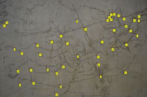
wall-map-photo-before-georef wall-map-photo-after-georef

Figure 1: Before (left) and after georeferencing and rectifying a wall map photographed using a smart phone. Yellow squares identify control points

To georeference and rectify a map in QGIS:

  1. Select Raster | Georeferencer | Georeferencer or click the Georeferencer toolbar button to display the georeferencer window.
  2. On the Georeferencer dialog, select File | Open Raster or click the Open raster toolbar button, and choose the image to georeference.
  3. When prompted, choose the destination coordinate system. Or, simply click Cancel to leave the coordinate system untagged.
  4. Click the Add point button and add control points at locations whose coordinates you know.
  5. Enter the real-world coordinates of each point in the grid at bottom of the dialog.
  6. Repeat for other control points.

With the control points defined you can now save them and then rectify the image:

  1. As a backup, save the created the control points by clicking the Save GCP points as
  2. Click the Transformation settings button to define the transformation and output settings, remembering that the polynomial 3 (cubic) and thin plate spline transformations need more control points than the other methods. Refer to the QGIS documentation for more information.
  3. Click the Start georeferencing button to create the rectified image.

It can be hard to choose the best transformation method for a heavily distorted image. Comparing the mean error (reported in the status bar) for each method is one way, although a lower error doesn’t always mean a better result. A more robust way is to rectify the image using each method and display it together with other data of known quality, or at the very least with coordinate gridlines overlaid. The method that gives the best overall match with the fewest local errors is the one you should use.

Although I’ve listed georeferencing before enhancement, keep in mind that files with internal georeferencing headers (such as GeoTIFF) will lose their georeferencing when you open them in photo editing software. To avoid this problem be sure to create an external georeferencing header (like a TAB, world, or aux.xml file) that can be (re)applied to the enhanced image. Or, simply enhance the image before you georeference it.

Step 5. Enhance and clean up the image

This step is carried out using photo editing software like Photoshop, Paint.net or GIMP, or within the vectorising software as part of Step 6. I prefer to use photo editing software because it gives me much better control of the result, especially with old or discoloured maps.

It’s much easier to clean up a previously-enhanced pure black and white image, so you should generally enhance your map before cleaning it up.

Enhance

Quality scans of clean and relatively modern paper maps generally need little, if any, enhancement, and a simple auto-levels adjustment is usually enough to remove any unevenness in the paper that might confuse the vectoriser. Scans of geological maps, very old maps, or maps photographed under poor lighting are a different story altogether. In this situation you must enhance the images before passing them to the vectoriser.

Because each image is unique there’s no single workflow that covers all situations, so I’ve provided a separate document of enhancement scenarios. You can see it in the Image Enhancement Cookbook (Secondary link)

image-enhancement-before image-enhancement-after

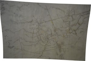
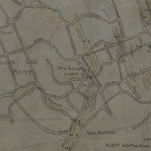
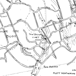
Figure 2: Before (left) and after enhancing the wall map photograph in Figure 1 for vectorisation

Take your time with this step and explore a few different enhancements before continuing. Applying the right image enhancements will produce vectorised linework that only needs a little cleaning up (Figure 2); applying the wrong (or no) enhancements could create a confusing bird’s nest of seemingly random lines, leaving you worse off than if you had manually digitised the map.

Clean-up

This cleaning pass is carried out using the eraser tool or paintbrush tool. You don’t need to clean up the whole map; just concentrate on the places where something touches the linework you want to vectorise. For example, a printed label might cross the linework, or someone may have written over an important part of the map. You should erase anything that touches the original linework (whilst leaving the linework intact) to make it easier for the vectoriser to see, as shown on Figure 3. Doing this now is much more efficient than on the vectorised version.

image-cleanup-before image-cleanup-after-annotated

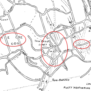
Figure 3: Before (left) and after cleaning up an image

Isolated dirt and marks that don’t touch the important linework are more easily deleted from the vectorised version and you can safely ignore them here: it’s quicker to click once to delete a vectorised line than to carefully paint out all of the pixels in the original image (at least in Micromine; it’s a bit more complex in a GIS).

Step 6. Vectorise (or digitise)

Although I’ll concentrate on automatic vectorising in this blog, it’s important to know that it isn’t a silver bullet that will magically convert your map into beautiful linework. And, depending on the map, manual heads-up digitising could still turn out to be the most efficient method.

Advantages of vectorising over heads-up digitising include:

  • Speed: Vectorising creates the entire map in a few seconds, instead of hours or days to digitise it from scratch
  • Ease: Editing existing linework is generally easier than creating it, which means you can assign the task to a less-skilled operator.

Disadvantages include:

  • Pre-processing: Vectorising puts a greater emphasis on enhancing the image beforehand, which might be beyond the skill of the available personnel
  • Hidden complexity: Cleaning up a complex map with lots of unwanted linework could take longer than digitising it from scratch.

Vectorise or digitise?

So how do you choose between vectorising and digitising? A safe way is to do a test run on a small “average” area of your map. Create vectorised and digitised versions of the same area and then compare the time taken and resulting accuracy of each version. Because speed and accuracy tend to be conflicting goals you’ll probably find that the most efficient method is a compromise between the two: not the fastest, nor the most accurate.

“Vectorising wins hands-down if you just need to create lines without worrying about details. Producing the linework is almost instant. There are no shortcuts with heads-up digitising – it’s either all or nothing.”

I prefer to vectorise as often as possible, although I’ve occasionally had to delete some of the vectorised lines in a map and digitise them instead.

Vectorising wins hands-down if you just need to create lines without worrying about details like cleaning-up, joining, or setting attributes. Georeferencing and enhancing the image are then the only time-consuming steps, and if you’re proficient with your software you can get them done in a couple of hours. Producing the linework is almost instant. There are no shortcuts with heads-up digitising – it’s either all or nothing.

If you’re in the unfortunate situation of having a map that can’t be vectorised, even after cleaning up and enhancing the image, you should resort to heads-up digitising instead. This is typical for older-style geological maps that use dark patterns or fill, like the one shown on Figure 4.

un-vectorisable-map-example

Figure 4: Numerous labels together with dark tints and stippling make this geological map almost impossible to vectorise

Software

Vectorising software works by detecting boundaries and edges in an image and then tracing over them with vector lines. The information it creates falls into three different feature types:

  • Points: Creates points defined by isolated dark pixels
  • Polylines: Creates polylines by following lines of dark pixels
  • Polygons: Creates polygons defined by areas of consistent colour

Some vectorisers have options for creating points, polylines and polygons from an image, while others are restricted to specific feature types. Here is a list of well-known commercial software and their supported feature types:

  • WinTopo Pro: Polylines only. Low cost (freeware version with reduced features)
  • ArcScan: Polygons and polylines (included free with ArcGIS 10.1 and later)
  • TNT MIPS: Polygons and polylines (free evaluation with limited functionality)
  • R2V: Polygons and polylines with many advanced options (free evaluation with limited functionality)

The following free and open source applications may be installed together using the OSGeo4W installer:

  • GRASS: points, polygons and polylines, but with a complex multi-stage workflow
  • QGIS: Polygons only
  • SAGA: Polygons only

Vectorising

The applications I’ve listed above have vastly different workflows ranging from very simple (WinTopo) to very complex with multiple stages (GRASS). I’ll go with WinTopo because of its simplicity. Even better, its freeware version lets you try it out with no limitations on the input and output file sizes.

Vectorising with WinTopo can be as simple as opening the image (via File | Open Image) and then clicking the One-Touch Vectorisation button. As you would expect, it understands georeferencing and will put the newly-created vectors in the right place. Of course, you can also experiment with its many options, which may become a necessity if you can’t get a good result the first time.

Once you’ve produced a decent set of vectors in WinTopo, save them (via File | Save Vector As) to a format Micromine (or your GIS) can understand, such as an Esri Shapefile or Mapinfo Interchange file. Avoid DXF because the files can become very large.

Conclusion

In this part I described the steps for the most important stages of this workflow: adjusting the image and then vectorising it. You’ve seen how:

  • Cropping the image to the map area keeps the focus on the data and eliminates wasted time and space associated with featureless pixels
  • Accurately georeferencing and rectifying the image is critical for creating linework that’s in the right place
  • Applying the right image enhancements will produce vector data that requires only minimal tidying up
  • Some images can’t be vectorised, and
  • Vectorising applications vary in the complexity of their workflows and their ability to support different feature types.

In Part 4 I’ll look at turning the raw linework produced by the vectoriser into a finished product suitable for use within an exploration or mine production planning setting.

Click here to view the Image Enhancement Cookbook  (Secondary link)

Scanning and Vectorising Old Mine Drawings and Maps – Part 2: Scanning

Frank Bilki
BAppSc (Applied Geology); GradDip (GIS & RS)
July 30, 2015

Introduction

Anyone working within a historic mining area will eventually need to digitise old paper drawings and maps. With ready access to modern high-quality large-format scanners, digitising a scanned copy of a map on a computer monitor (via heads-up digitising) has essentially superseded traditional digitising tablets. Even better, you can automate much of the process for clean maps that have few or no filled areas.

In Part 1 of this blog I outlined the overall scanning and vectorising workflow, and in this part I’ll describe the scanning stage and explain some techniques for obtaining the best possible result. Clearly, the workflow begins with the paper original.

Processing steps

A typical paper-to-digital workflow includes the following steps, and this part discusses steps 1 and 2, shown in bold:

1. Clean up the paper map
2. Scan
3. Crop
4. Georeference, rectify, and optionally reproject the map as accurately as possible
5. Enhance and clean up the scanned image
6. Vectorise (or digitise)
7. Import into the target application
8. Clean up the linework
9. Join, tag, and attribute the linework, and optionally assign elevations if working in 3-D

The workflow – paper to scanned image

Converting a paper map into a scanned image involves these steps:

Step 1. Clean up the paper map

Cleaning up the paper map should be done lightly with a good quality soft eraser to avoid damaging the paper. Getting rid of obvious scuffs, dirt or fingerprints now is better than cleaning up the scanned version afterwards.

Step 2. Scan

Most office/print companies offer scanning services; search for “large format scanning” to find one in your local area. Be sure to discuss the following points during your consultation with the service provider:

Scan resolution, dimensions and file size

Try to scan the map with just enough resolution to clearly show the smallest important features. Very high resolution only makes the file larger and harder to work with, without adding detail, and may even overwhelm your computer. Given that most plotters have an effective resolution around 300 ppi (pixels-per-inch, where each pixel comprises a smattering of cyan, magenta, yellow and black dots) this is a good starting value. You might need to step up to 400 ppi for maps containing lots of small detail, but you shouldn’t have to go any higher than that.

Always determine the scan size using its resolution and physical size, not its file size. For example, an A0 map (33.1 × 46.8 inches; 841 × 1189 mm) scanned at 300 ppi will have a physical size of 9930 × 14040 pixels. Scanner operators with a graphic design background may be accustomed to describing scans in terms of their file size, for example “a 20 megabyte scan”, but this makes it hard to know what you’re really getting.

Scan type (number of colours)

If the map is clean and contains single-colour line drawings then a black-and-white (1-bit) or greyscale (8-bit) scan is ideal. But if it contains coloured linework or filled polygons, then you’ll need to do a true colour (24-bit) scan. Figure 1 shows the same map using the three different image types. Note the slight greyness of the paper near the bottom of the greyscale image.

1-bit-scan

Figure 1: 1-bit image

8-bit-scan

8-bit image

24-bit-scan

24-bit image

Always scan very old and heavily discoloured maps in true colour. The automatic threshold of a black-and-white scan can’t distinguish genuinely dark linework from dark paper, and a greyscale scan might display different colours in the same shade of grey. Once colour is lost it can’t be recovered, so removing discolouration while preserving data is best done with photo editing software.

File format

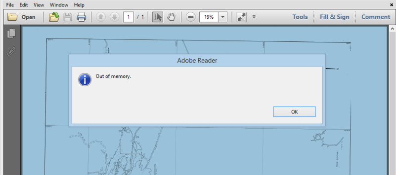
Save the scan to a lossless compressed image format such as TIF. Avoid JPG, period. And avoid saving to PDF; you’ll have limited control over the image compression and will have to extract the image from the PDF anyway, which can be hard to do with large scans (Figure 2). Scanning to PDF may also introduce compression artefacts that could confuse the vectoriser.

Adobe-Reader-out-of-memory

Figure 2: A typical result of attempting to extract a large scan from a PDF file

Photography

You may not always get a chance to scan a map, and in this situation you can always resort to photographing it instead. For the very best results you should use a digital SLR camera mounted on a copy stand, with a high quality macro lens and remote release, and two identical lights shining at 45° from opposite sides of the map.

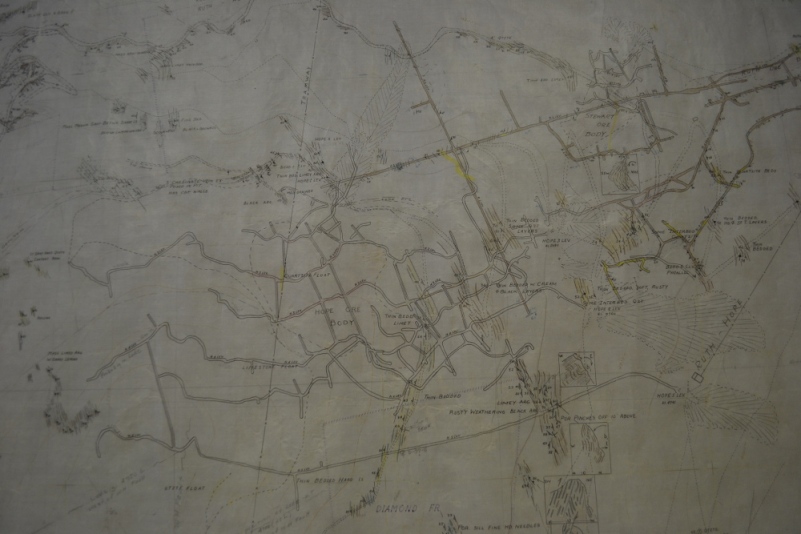
However, the practicalities of the real world mean you’ll end up using whichever camera you’re carrying, and you’ll photograph the map in less-than optimal lighting. Don’t despair; I’ve obtained reasonable results from shadowy wall-map photographs taken with a hand-held smart phone (Figure 3)! Although the photos needed a lot of post-processing they still produced usable data. You’ll see the enhanced version in Part 3.

wall-map-photo-before-processing

Figure 3: A wall-mounted map photographed using a smartphone

Conclusion

In this part I described the preparation and information needed to create a good scan of your original map. You can have the best vectorising software or digitiser operator in the world, but if the scan is poor the resulting linework will also be poor. It’s well worth taking the time to ensure you create the best possible scan from a paper map that’s in the best possible condition. A few minutes cleaning up the paper map, and a few minutes discussing your exact requirements with the scanner operator can save hours of editing later on.

In Part 3 I’ll look at turning the scanned image into digital linework.

Scanning and vectorising old mine drawings and maps – Part 1: Introduction

Frank Bilki
BAppSc (Applied Geology); GradDip (GIS & RS)
July 23, 2015

Introduction

Anyone working within a historic mining area will eventually need to digitise old paper drawings and maps. Even in a modern mine you may need to re-digitise existing paper plots if the original digital data is lost. Years ago this would be done by taping the paper onto a digitising tablet and laboriously tracing the puck over the linework. In fact, even today we still get occasional requests to recommend a digitising tablet.

Nowadays there are much more efficient ways to digitise paper-based data, either manually or by using automated vectorising software. In this series of posts I’ll describe a workflow for efficiently preparing paper-based maps and turning them into digital (and optionally 3-D) linework. The workflow applies equally if you use Micromine, a GIS application, or something else. And, in keeping with the free theme I established in my earlier posts I’ll provide free software recommendations at the relevant stages.

Source data

The three most common data sources that might need to be scanned and vectorised are:

  • Contour maps (including surface mine plans)
  • Underground mine plans and drawings
  • Geological maps

I’ll focus on maps and drawings that are in plan-view orientation, and won’t consider cross-sectional drawings. Although sectional views use essentially the same workflow, not all applications support 3-D georeferencing. Plus, converting the linework from pixel coordinates back to real-world 3-D coordinates can be tricky when the section plane is not parallel to the coordinate system or has bends in it. Although I don’t have any direct experience with modern CAD applications I believe some of them do have this ability, so please feel free to leave a comment if you have any experience with this kind of data.

Contour maps

Contour maps cover a wide range of data types like surface topography (which may incorporate surface mining activities like pit and dump contours), geophysics, and geochemistry. A typical map usually only includes contour lines and their labels, which may either be black or coloured (Figure 1). The map may sometimes include general annotations, although they’re usually kept to a minimum because they tend to obstruct the contours.

Contour maps rarely include areas containing solid or pattern fill.

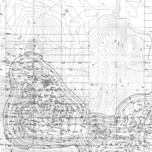
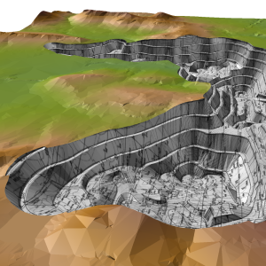
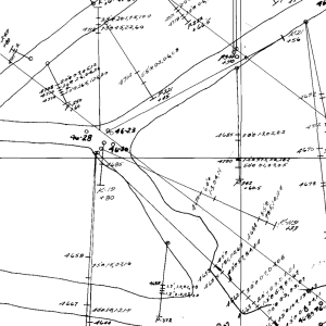
Figure 1: A scanned contour map (left) and

Figure 1: A scanned contour map (left)

resulting 3-D digital elevation model

…and resulting 3-D digital elevation model

This kind of map is ideal for automated vectorising, in which the software does most of the digitising. You then spend your time cleaning up the resulting linework and assigning contour elevations. Because of their topological simplicity (for example, contour lines never branch, cross over, or change value), these maps are usually the easiest to process.

Underground mine plans and drawings

Underground mine plans and drawings normally contain a lot of linework and a large number of labels, which may be black or coloured (Figure 2). They generally don’t include areas containing solid or pattern fill.

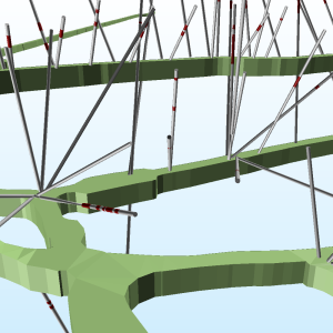
Figure 2: A scanned underground mine plan and

Figure 2: A scanned underground mine plan

resulting 3-D drillholes and solids

…and resulting 3-D drillholes and solids

Mine plans are also ideal for automated vectorising, although they are harder to process than contour maps. Because underground mines have complex 3-D topology (a spiral decline crosses itself when seen in plan view, and a heading can change from a decline to a level working without an obvious line break), it’s also much harder to assign elevations.

Geological Maps

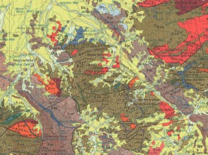
Geological maps, especially old ones, usually contain areas with pattern fills that represent different rock or alteration types (Figure 3). Because these filled areas sometimes use dark colours and patterns they are much more difficult to vectorise than linework drawings.

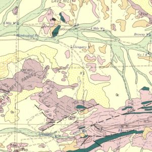
Figure 3: A scanned geology map

Figure 3: A scanned geology map

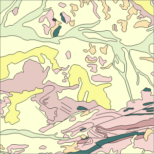
and resulting 2-D vectors

…and resulting 2-D vectors

It’s possible to vectorise an old geological map provided you can enhance the differences between lines and filled areas. The goal is to produce an image dominated by lines, with little or no visible fill. This obviously becomes harder to achieve when the map includes dark fills or patterns, and in this case the only practical alternative may be to digitise it manually. In Part 3 I’ll provide some ideas on how to process and enhance a scanned old-style geological map for vectorisation.

In contrast, modern geological maps with light or single-colour (solid) fills are easier to deal with. Maps that only contain polygons (with no other lines) are a good example of this kind of map. Each polygon must be borderless and use a solid single-colour fill, and adjoining polygons must have different colours. These maps are typically produced by geophysical interpretation or satellite image classification and are less common than regular geological maps. Fortunately they are easily polygonised (vectorised) using any GIS application.

Digitising paper

This workflow relies on the idea of heads-up digitising, in which a person digitises a scanned image of a map on a computer monitor instead of tracing over the paper original on a digitising tablet (which has come to be known as heads-down digitising). Heads-up digitising has some important advantages over an old-style digitising tablet, making it the preferred method in most situations:

  • The cost of scanning even the largest map is small compared to the cost of a digitising tablet.
  • Distortion (from folds, tears, stretching, or bad scanning) can be removed by rectifying the image. These defects can’t be removed when the original map is taped onto a digitiser.
  • Vectorising software can create an initial version of the entire map, avoiding the need to digitise it from scratch.
  • Because the digitised lines are shown over the scanned map, mis­takes are easier to find and fix.
  • The scan is a digital archive that can be reprojected, shared and viewed by many people.

Processing steps

A typical paper-to-digital workflow includes the following steps:

  1. Clean up the paper map
  2. Scan
  3. Crop
  4. Georeference, rectify, and optionally reproject the map as accurately as possible
  5. Enhance and clean up the scanned image
  6. Vectorise (or digitise)
  7. Import into the target application
  8. Clean up the linework
  9. Join, tag, and attribute the linework, and optionally assign elevations if working in 3-D

I’ve divided these steps into three separate posts that focus on different stages of the workflow:

  • Part 2 concentrates on Steps 1 and 2, turning a paper map into a scanned image
  • Part 3 focuses on Steps 3 through 6, turning the scanned image into digital linework
  • Part 4 covers Steps 7, 8 and 9, turning the raw linework into a finished product.

You probably noticed that ‘clean up’ appears in three different places. The individual passes will become clearer as you read each part of the blog.

Conclusion

Although the minerals industry embraced digital technology back in the 1980s there are still many historic mines with huge (and unused) archives of paper data. Converting these paper maps into a digital, and preferably 3-D, format can be daunting but is vital for making this legacy information accessible to modern-day operations. You’ll learn how to do this in the upcoming posts, starting with Part 2: Scanning.